SlideShare a Scribd company logo
1 of 11
 
Magazine Research In order to get ideas on how we wanted our magazine’s to look we had to research into another magazine. The magazine I chose to research was ninja . It is an art magazine that’s focused on photography. I like the feel of this magazine and it’s very modern and simplistic. It also has a catchy name and all these things helped to inspire my magazine.
Front Cover Evaluation The front cover was intended to give a laid back fashionable feel. As a student I have often thought that common student magazines have a focus on trying to be enthusiastic and energetic and after a long day’s work the last thing I want to do is sit down and look at some overly-enthusiastic model having the fun I wanted also it often goes quite wrong and looks a bit too much of a farce. I just want to sit back and relax, something I wanted to portray with the soup’s design.
Contents Page  Evaluation The contents page gives a look as to what the magazine contains, therefore it was important to me that I gave the right impression on this. I decided the contents would focus on photography and used photo’s from the cover shoot as I was happy in the feeling that these gave.
Exploring Font's In creating my magazine I had to consider different font’s that could be used for the magazine. These font’s were found on the defont website, however I chose to use font’s which were already installed on the photoshop as although the font’s found on the website looked good, there would be more work in getting rid of the white background which each of the font’s had and I really felt that the Stencil Std. font I used for the title suited the magazine better.
Development -  Front Cover To Create the front cover it was first essential to create a logo. I choose to create my logo like so as I think it was a stylish, compact way to give the information as to what the magazine was and who it was targeted to. The bar at the bottom of the page will hold a feature article. I chose to use the green colour as it is a colour that’s stylish in the autumn winter fashion, which I had already decided my magazine would be focused on.
The next stage to creating a front cover was deciding as to which stories would be inside the magazine. I chose my stories based on what I felt students would be interested in. I think the masthead is placed well here and it seemed natural to place it here as the magazine is balanced and doesn’t have too much text on one side or the other.  Development -  Front Cover
After adding an image and some final touches the front cover is complete. I like my front cover as I think it looks proffesional and gices the intended look of the magazine. To improve my magazine front cover I added a black border around the ’20’ which I think made it stand out more as originally it wasn’t completely visible as it blended into the background image somewhat. I also added ‘The FASHION issue’ at the bottom which tell’s the reader the main focus of this magazine.  Final Front Cover
The development of the contents page was quite simple at this stage. I had to choose a way in which to display what the articles were. I chose to use the green shapes in order to connect the contents page with the front cover via the green banner at the bottom of the front cover, as well as the colour of the 20 number. I used the fonts as another way to connect the contents and front cover pages. Development -  Contents Page
I chose to put this photo as the main focus of the page as I think it is one of the most beautiful images taken at the shoot and I wanted to display it. I like this image as it is very relaxed and dream like and the shoes in the picture are very beautiful. I thought about changing the colour of the text over the image however when I experimented with this the black writing was still the text which was most legible.  Development -  Contents Page
Final Contents Page I finished my contents page’s design by adding some images to the top which I also liked from the shoot. I think all these images display a free image which is one of the magazine’s focus points. I also added the magazine title at the top corner in a smaller size. I choose to present this in white as I thought it would be more legible and that it balanced the black writing on the page.

More Related Content

What's hot

New conetnts page presentation
New conetnts page presentationNew conetnts page presentation
New conetnts page presentationhazal18
 
Comparison between preliminary task and final product
Comparison between preliminary task and final productComparison between preliminary task and final product
Comparison between preliminary task and final productRyan Talmage
 
Creating the front cover
Creating the front coverCreating the front cover
Creating the front coverdw1993
 
Construction of contents page
Construction of contents pageConstruction of contents page
Construction of contents pageAS Media Column D
 
Printscreen Powerpoint 2
Printscreen Powerpoint 2Printscreen Powerpoint 2
Printscreen Powerpoint 2Kero00
 
Uniform magazine evaluation
Uniform magazine evaluationUniform magazine evaluation
Uniform magazine evaluationKieranSalt
 
Screenshots for front cover
Screenshots for front coverScreenshots for front cover
Screenshots for front covermollieafh
 
Attracting The Reader
Attracting The ReaderAttracting The Reader
Attracting The Readerjemmagraham
 
Double page process
Double page processDouble page process
Double page processr06424
 
Printscreen Powerpoint 2
Printscreen Powerpoint 2Printscreen Powerpoint 2
Printscreen Powerpoint 2Kero00
 
Evaluation of college magazine
Evaluation of college magazine Evaluation of college magazine
Evaluation of college magazine Toby16
 

What's hot (14)

New conetnts page presentation
New conetnts page presentationNew conetnts page presentation
New conetnts page presentation
 
Comparison between preliminary task and final product
Comparison between preliminary task and final productComparison between preliminary task and final product
Comparison between preliminary task and final product
 
Print screens of contents
Print screens of contentsPrint screens of contents
Print screens of contents
 
Print screens
Print screensPrint screens
Print screens
 
Creating the front cover
Creating the front coverCreating the front cover
Creating the front cover
 
Construction of contents page
Construction of contents pageConstruction of contents page
Construction of contents page
 
Printscreen Powerpoint 2
Printscreen Powerpoint 2Printscreen Powerpoint 2
Printscreen Powerpoint 2
 
Uniform magazine evaluation
Uniform magazine evaluationUniform magazine evaluation
Uniform magazine evaluation
 
Screenshots for front cover
Screenshots for front coverScreenshots for front cover
Screenshots for front cover
 
Attracting The Reader
Attracting The ReaderAttracting The Reader
Attracting The Reader
 
Print screens2
Print screens2Print screens2
Print screens2
 
Double page process
Double page processDouble page process
Double page process
 
Printscreen Powerpoint 2
Printscreen Powerpoint 2Printscreen Powerpoint 2
Printscreen Powerpoint 2
 
Evaluation of college magazine
Evaluation of college magazine Evaluation of college magazine
Evaluation of college magazine
 

Similar to The soup presentation

Production reflection fmp
 Production reflection fmp Production reflection fmp
Production reflection fmpjackedwardsz
 
Evaluation 7
Evaluation 7Evaluation 7
Evaluation 7chlojeann
 
Magazine cover process
Magazine cover processMagazine cover process
Magazine cover processCeri Lewis
 
Q1. In what ways does your media product use, develop or challenge forms and ...
Q1. In what ways does your media product use, develop or challenge forms and ...Q1. In what ways does your media product use, develop or challenge forms and ...
Q1. In what ways does your media product use, develop or challenge forms and ...wallflowersssss
 
College magazine evaluation
College magazine evaluationCollege magazine evaluation
College magazine evaluationlollilauren
 
Using Photoshop For My College Magazine
Using Photoshop For My College MagazineUsing Photoshop For My College Magazine
Using Photoshop For My College MagazineRBloomfield
 
Q1 In what ways does your media product use, develop or challenge forms and c...
Q1 In what ways does your media product use, develop or challenge forms and c...Q1 In what ways does your media product use, develop or challenge forms and c...
Q1 In what ways does your media product use, develop or challenge forms and c...wallflowersssss
 
Q1. In what ways does your media product use, develop or challenge forms and ...
Q1. In what ways does your media product use, develop or challenge forms and ...Q1. In what ways does your media product use, develop or challenge forms and ...
Q1. In what ways does your media product use, develop or challenge forms and ...wallflowersssss
 
Magazine design evaluation
Magazine design evaluationMagazine design evaluation
Magazine design evaluationempentertainment
 
6. production reflection (1) ellie schreurs works power point
6. production reflection (1) ellie schreurs works power point6. production reflection (1) ellie schreurs works power point
6. production reflection (1) ellie schreurs works power pointEllieschreurs
 
Preliminary Task: Evaluation
Preliminary Task: EvaluationPreliminary Task: Evaluation
Preliminary Task: Evaluationhurricanehaley
 
Annalysing my college magazine
Annalysing my college magazineAnnalysing my college magazine
Annalysing my college magazineMolly Strike
 
Music Magazine Construction
Music Magazine Construction Music Magazine Construction
Music Magazine Construction JanineLaidley1
 
6. production reflection(1) 1
6. production reflection(1) 16. production reflection(1) 1
6. production reflection(1) 1jackedwards46
 

Similar to The soup presentation (20)

Magazine Evaluation PowerPoint
Magazine Evaluation PowerPointMagazine Evaluation PowerPoint
Magazine Evaluation PowerPoint
 
Production reflection fmp
 Production reflection fmp Production reflection fmp
Production reflection fmp
 
Evaluation 7
Evaluation 7Evaluation 7
Evaluation 7
 
Magazine cover process
Magazine cover processMagazine cover process
Magazine cover process
 
Q1. In what ways does your media product use, develop or challenge forms and ...
Q1. In what ways does your media product use, develop or challenge forms and ...Q1. In what ways does your media product use, develop or challenge forms and ...
Q1. In what ways does your media product use, develop or challenge forms and ...
 
Fmp evaluation real
Fmp evaluation realFmp evaluation real
Fmp evaluation real
 
College magazine evaluation
College magazine evaluationCollege magazine evaluation
College magazine evaluation
 
Using Photoshop For My College Magazine
Using Photoshop For My College MagazineUsing Photoshop For My College Magazine
Using Photoshop For My College Magazine
 
Q1 In what ways does your media product use, develop or challenge forms and c...
Q1 In what ways does your media product use, develop or challenge forms and c...Q1 In what ways does your media product use, develop or challenge forms and c...
Q1 In what ways does your media product use, develop or challenge forms and c...
 
Q1. In what ways does your media product use, develop or challenge forms and ...
Q1. In what ways does your media product use, develop or challenge forms and ...Q1. In what ways does your media product use, develop or challenge forms and ...
Q1. In what ways does your media product use, develop or challenge forms and ...
 
Fmp evaluation
Fmp evaluationFmp evaluation
Fmp evaluation
 
Magazine design evaluation
Magazine design evaluationMagazine design evaluation
Magazine design evaluation
 
6. production reflection (1) ellie schreurs works power point
6. production reflection (1) ellie schreurs works power point6. production reflection (1) ellie schreurs works power point
6. production reflection (1) ellie schreurs works power point
 
Preliminary Task: Evaluation
Preliminary Task: EvaluationPreliminary Task: Evaluation
Preliminary Task: Evaluation
 
7. evaluation(1)
7. evaluation(1)7. evaluation(1)
7. evaluation(1)
 
Annalysing my college magazine
Annalysing my college magazineAnnalysing my college magazine
Annalysing my college magazine
 
Music Magazine Construction
Music Magazine Construction Music Magazine Construction
Music Magazine Construction
 
Evaluation
EvaluationEvaluation
Evaluation
 
Evaluation
EvaluationEvaluation
Evaluation
 
6. production reflection(1) 1
6. production reflection(1) 16. production reflection(1) 1
6. production reflection(1) 1
 

More from sophieasmagazine

Music magazine evaluation slideshare version final
Music magazine evaluation slideshare version finalMusic magazine evaluation slideshare version final
Music magazine evaluation slideshare version finalsophieasmagazine
 
Music magazine evaluation 2
Music magazine evaluation 2Music magazine evaluation 2
Music magazine evaluation 2sophieasmagazine
 
Music magazine evaluation 2
Music magazine evaluation 2Music magazine evaluation 2
Music magazine evaluation 2sophieasmagazine
 
College magazine presentation
College magazine presentation College magazine presentation
College magazine presentation sophieasmagazine
 

More from sophieasmagazine (8)

Music video research
Music video researchMusic video research
Music video research
 
Evaluation sophie
Evaluation   sophieEvaluation   sophie
Evaluation sophie
 
Music magazine evaluation slideshare version final
Music magazine evaluation slideshare version finalMusic magazine evaluation slideshare version final
Music magazine evaluation slideshare version final
 
Music magazine evaluation 2
Music magazine evaluation 2Music magazine evaluation 2
Music magazine evaluation 2
 
Music magazine evaluation 2
Music magazine evaluation 2Music magazine evaluation 2
Music magazine evaluation 2
 
The soup presentation
The soup presentationThe soup presentation
The soup presentation
 
The soup presentation
The soup presentationThe soup presentation
The soup presentation
 
College magazine presentation
College magazine presentation College magazine presentation
College magazine presentation
 

The soup presentation

  • 1.  
  • 2. Magazine Research In order to get ideas on how we wanted our magazine’s to look we had to research into another magazine. The magazine I chose to research was ninja . It is an art magazine that’s focused on photography. I like the feel of this magazine and it’s very modern and simplistic. It also has a catchy name and all these things helped to inspire my magazine.
  • 3. Front Cover Evaluation The front cover was intended to give a laid back fashionable feel. As a student I have often thought that common student magazines have a focus on trying to be enthusiastic and energetic and after a long day’s work the last thing I want to do is sit down and look at some overly-enthusiastic model having the fun I wanted also it often goes quite wrong and looks a bit too much of a farce. I just want to sit back and relax, something I wanted to portray with the soup’s design.
  • 4. Contents Page Evaluation The contents page gives a look as to what the magazine contains, therefore it was important to me that I gave the right impression on this. I decided the contents would focus on photography and used photo’s from the cover shoot as I was happy in the feeling that these gave.
  • 5. Exploring Font's In creating my magazine I had to consider different font’s that could be used for the magazine. These font’s were found on the defont website, however I chose to use font’s which were already installed on the photoshop as although the font’s found on the website looked good, there would be more work in getting rid of the white background which each of the font’s had and I really felt that the Stencil Std. font I used for the title suited the magazine better.
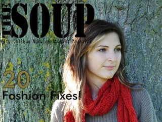
  • 6. Development - Front Cover To Create the front cover it was first essential to create a logo. I choose to create my logo like so as I think it was a stylish, compact way to give the information as to what the magazine was and who it was targeted to. The bar at the bottom of the page will hold a feature article. I chose to use the green colour as it is a colour that’s stylish in the autumn winter fashion, which I had already decided my magazine would be focused on.
  • 7. The next stage to creating a front cover was deciding as to which stories would be inside the magazine. I chose my stories based on what I felt students would be interested in. I think the masthead is placed well here and it seemed natural to place it here as the magazine is balanced and doesn’t have too much text on one side or the other. Development - Front Cover
  • 8. After adding an image and some final touches the front cover is complete. I like my front cover as I think it looks proffesional and gices the intended look of the magazine. To improve my magazine front cover I added a black border around the ’20’ which I think made it stand out more as originally it wasn’t completely visible as it blended into the background image somewhat. I also added ‘The FASHION issue’ at the bottom which tell’s the reader the main focus of this magazine. Final Front Cover
  • 9. The development of the contents page was quite simple at this stage. I had to choose a way in which to display what the articles were. I chose to use the green shapes in order to connect the contents page with the front cover via the green banner at the bottom of the front cover, as well as the colour of the 20 number. I used the fonts as another way to connect the contents and front cover pages. Development - Contents Page
  • 10. I chose to put this photo as the main focus of the page as I think it is one of the most beautiful images taken at the shoot and I wanted to display it. I like this image as it is very relaxed and dream like and the shoes in the picture are very beautiful. I thought about changing the colour of the text over the image however when I experimented with this the black writing was still the text which was most legible. Development - Contents Page
  • 11. Final Contents Page I finished my contents page’s design by adding some images to the top which I also liked from the shoot. I think all these images display a free image which is one of the magazine’s focus points. I also added the magazine title at the top corner in a smaller size. I choose to present this in white as I thought it would be more legible and that it balanced the black writing on the page.